When you are part of a team that is blessed with innovative skill, it is often tempting to mine that rich vein of creative talent for all the projects you are presented with. But there are times when it is important to remind oneself that we don’t always need to reinvent the wheel.
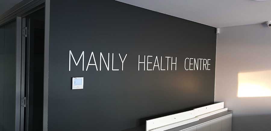
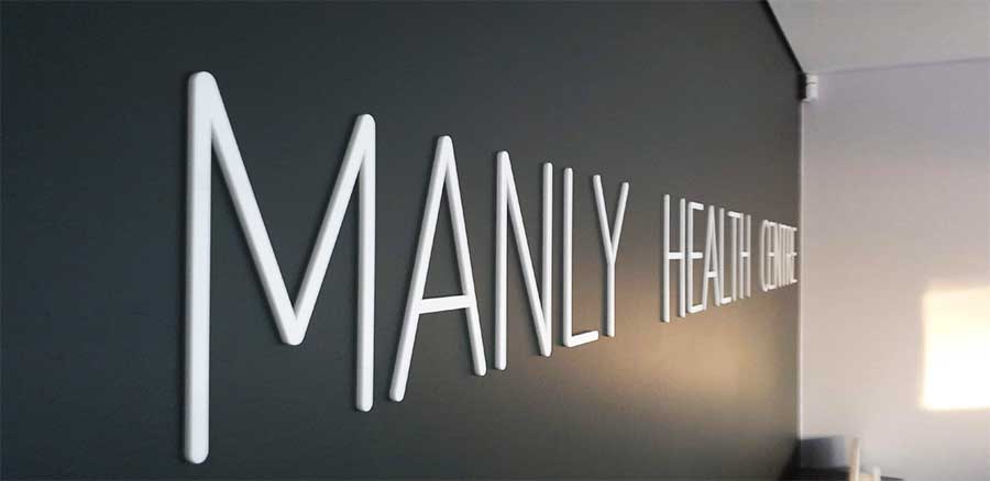
And such was the case when Manly Health Centre reached out to us to design and install a large 3D sign for their reception wall. This was an opportunity for us to call upon classic business signage aesthetic: minimalist in approach without distractions.
The white acrylic lettering against the dark-grey wall offers perfect contrast. A crisp, clearly-defined announcement that conveys certainty and reassurance.
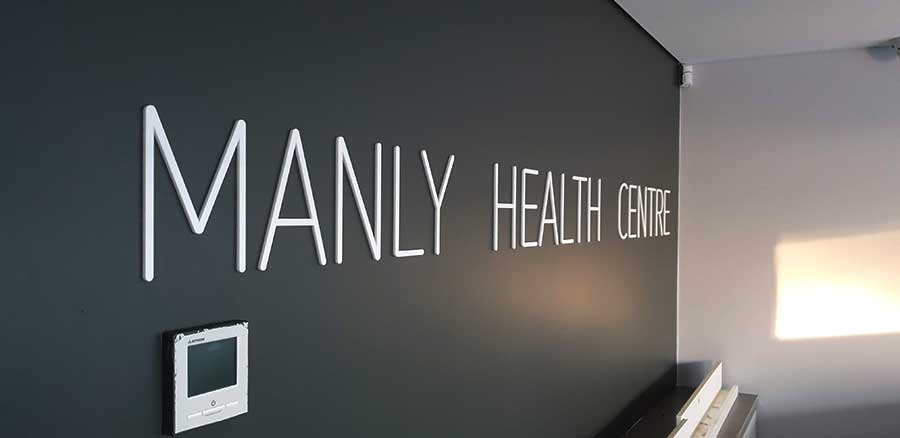
And the large 3D letters carry weight and imbue the setting with a sense of importance.
This type of business signage is a great example of effectiveness through simplicity.
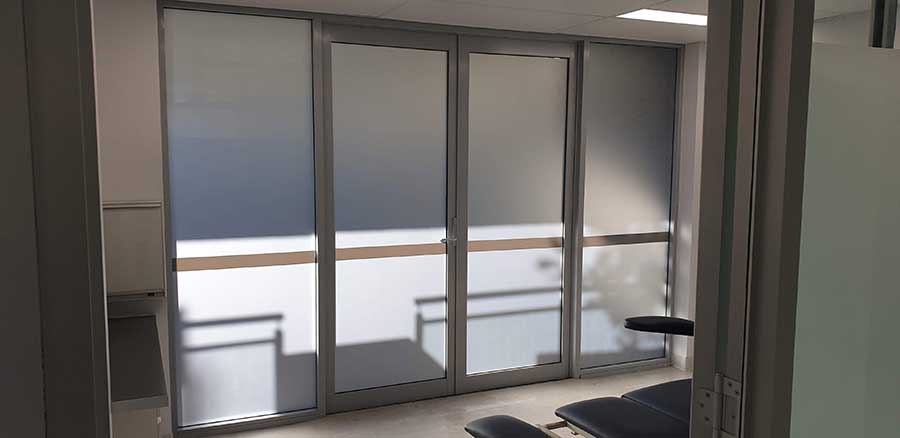
The other component of this project was window frosting.
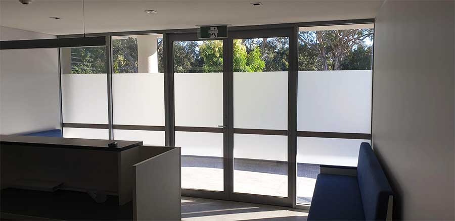
There are few places where privacy is of greater importance than a visit to the doctor. So this project would see Sydney Signs Portal installing classic quality privacy window frosting throughout the entire clinic.
We utilised a combination of fully frosted and partially-frosted techniques – depending on the client’s requirements for each space.
Fully-frosted glass provides 100% privacy, while still allowing the luxury of 95% of daylight to pass through. Partial frosting can protect certain rooms from unwanted eyes, or limit distractions while ensuring the space remains non-claustrophobic.
And, at the end of the day, all of these elements combine perfectly when installed to the high professional standards that are the trademark of Sydney Signs Portal.

